
33
Pages in the brand book

For 15 years, ACHR has given entrepreneurs in Bucharest and Ilfov accounting, payroll, financial consulting and HR. We repositioned the company around clarity and financial peace of mind, and on that idea we built the rebranding, the design, the new website and the conversion logic of its pages.
For the attention analysis, we applied the same residual spectral saliency method (Hou & Zhang) to the 1440×820 px first screen of both versions, which showed the same message. It is an algorithmic analysis of visual contrast, without eye-tracking. Screenshots taken on 16 October 2026.
„Site-ul pare învechit și noi păream că nu suntem la zi cu legislația.”
“The website looks outdated, and we looked like we were not up to date with the legislation.”
Mihai Stanca · CDO & Partner, ACHR
ACHR already had 15 years of activity and more than 300 satisfied clients, two things that matter for an accounting company. The image said something else, though. The colors and the logo had no connection to the three services, and the styles and icons changed from one section to the next.
We started from what the two founders want for their clients, then analysed the company's data before writing the message.
The Why / What / How questionnaire completed with both founders, an analysis of ten years of invoicing and of the clients who matter most to the company, the brand audit and the competitor study.
Entrepreneurs look to their accountant for clarity, peace of mind and a partner they can trust, alongside correct numbers.
The central attribute of the brand is Clarity, and the values are Ethics, Integrity and Clarity. From the words of the two founders came the message „Claritate și liniște financiară” (“Financial clarity and peace of mind”).
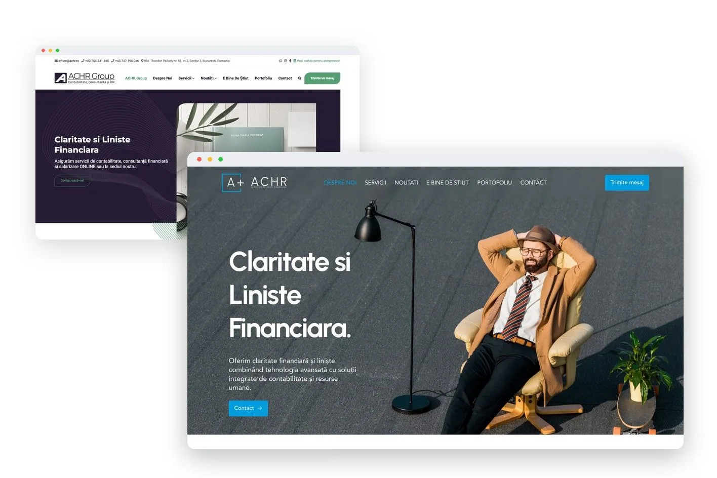
The message first reached the old site, on the first screen. The design buried the message, though: the headline was marked up as a secondary heading, the page had no main heading at all, and the headline drew only 7% of the first screen's attention. The rebrand and the new website put the message front and centre.
The new headlines are the ones we wrote in April 2025 and published on achr.ro. The old headlines are the ones from the old site, captured on 16 October 2026. The English lines are translations of the Romanian originals.
The old identity used colors and a logo with no link to the company's three services, and the styles and icons changed from one section to the next, with no common system. The new identity starts from the A+ symbol. The open square ties the three services into a single system, and the plus sign stands for added value. The symbol stays legible from the favicon to the sign on the building.




The palette has four core colors and two accents, used on less than 5% of the surface. The typography is a single family, Urbanist.
Everything went into a 33-page brand book, so that the client and any future supplier can use the same system.
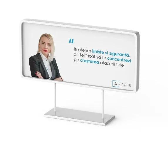
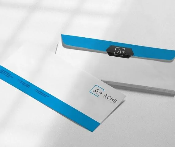
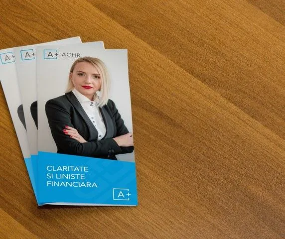
The identity shows on every surface of the company. The same system appears on the website, the business cards, the leaflet and the envelope, in the 10 email signatures and on the social media covers. The communication system completes the identity through ads and video scripts that carry the same message, and photos of relaxed people show financial peace of mind.
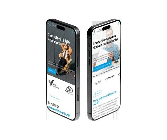
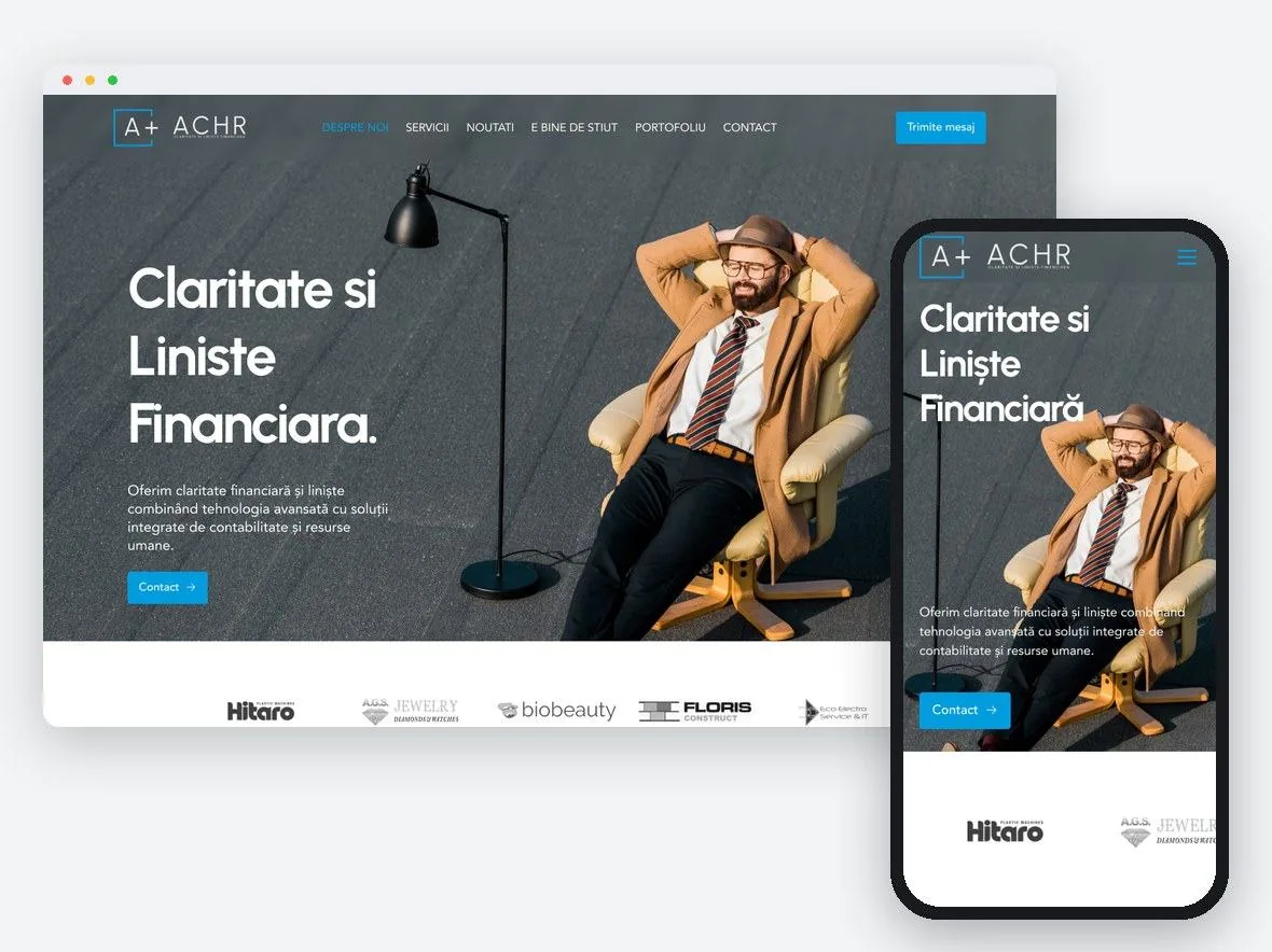
The new site was simplified by removing seven old pages, among them the monthly promotion, e-invoicing and the newsletter, and the services are now grouped in a single menu. The homepage has a header with 8 elements instead of 18, the A+ identity appears everywhere, the message sits in the foreground, and client logos appear right below the main image.
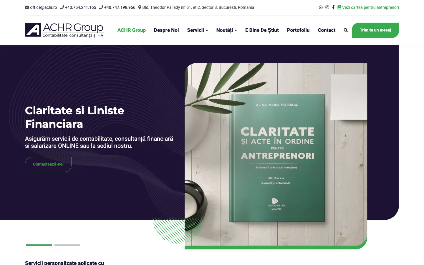
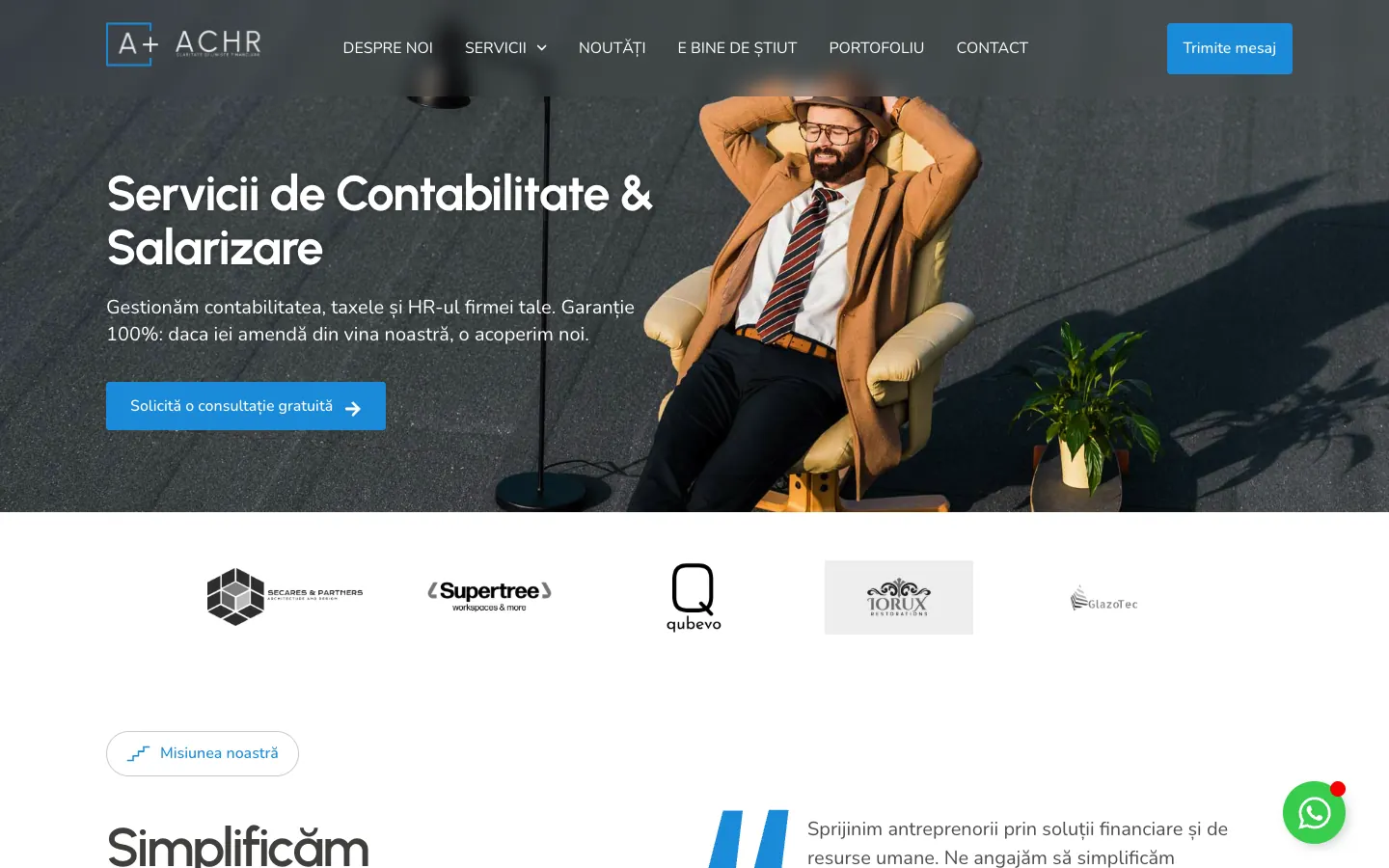
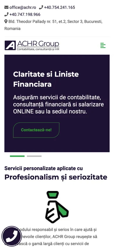
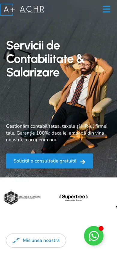
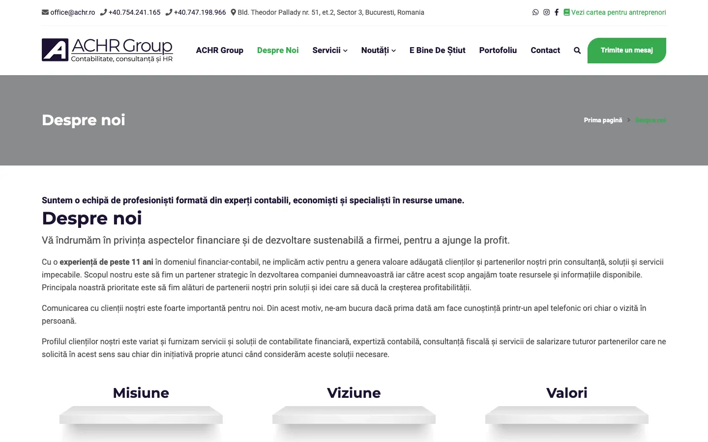
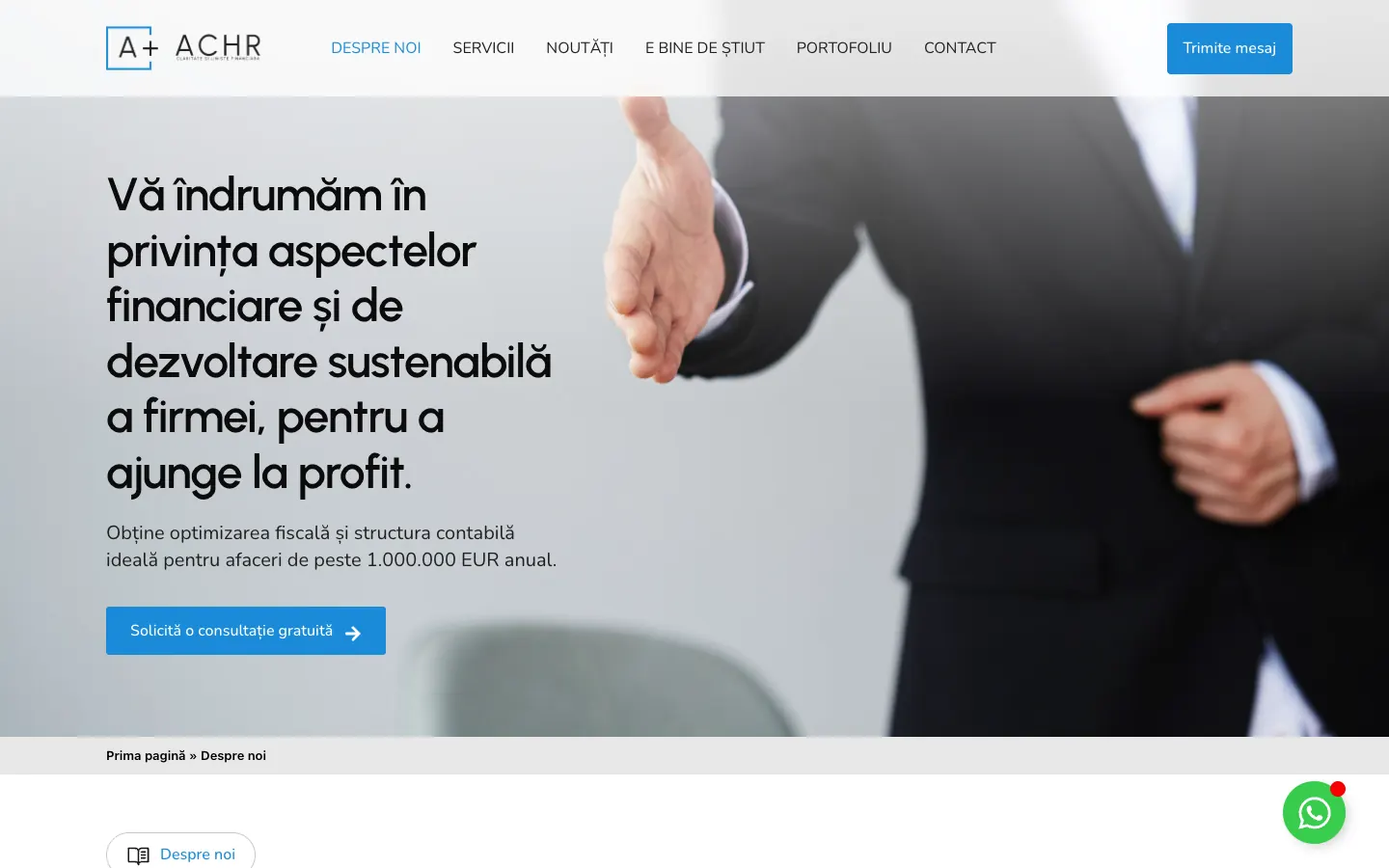
The founder appears with a face and a voice, the company's numbers (15 years, more than 300 clients) are in plain sight, and the text has a clear hierarchy. Before, the text was dense, the benefits sat in two long checklists, and the values hid in columns of small print.
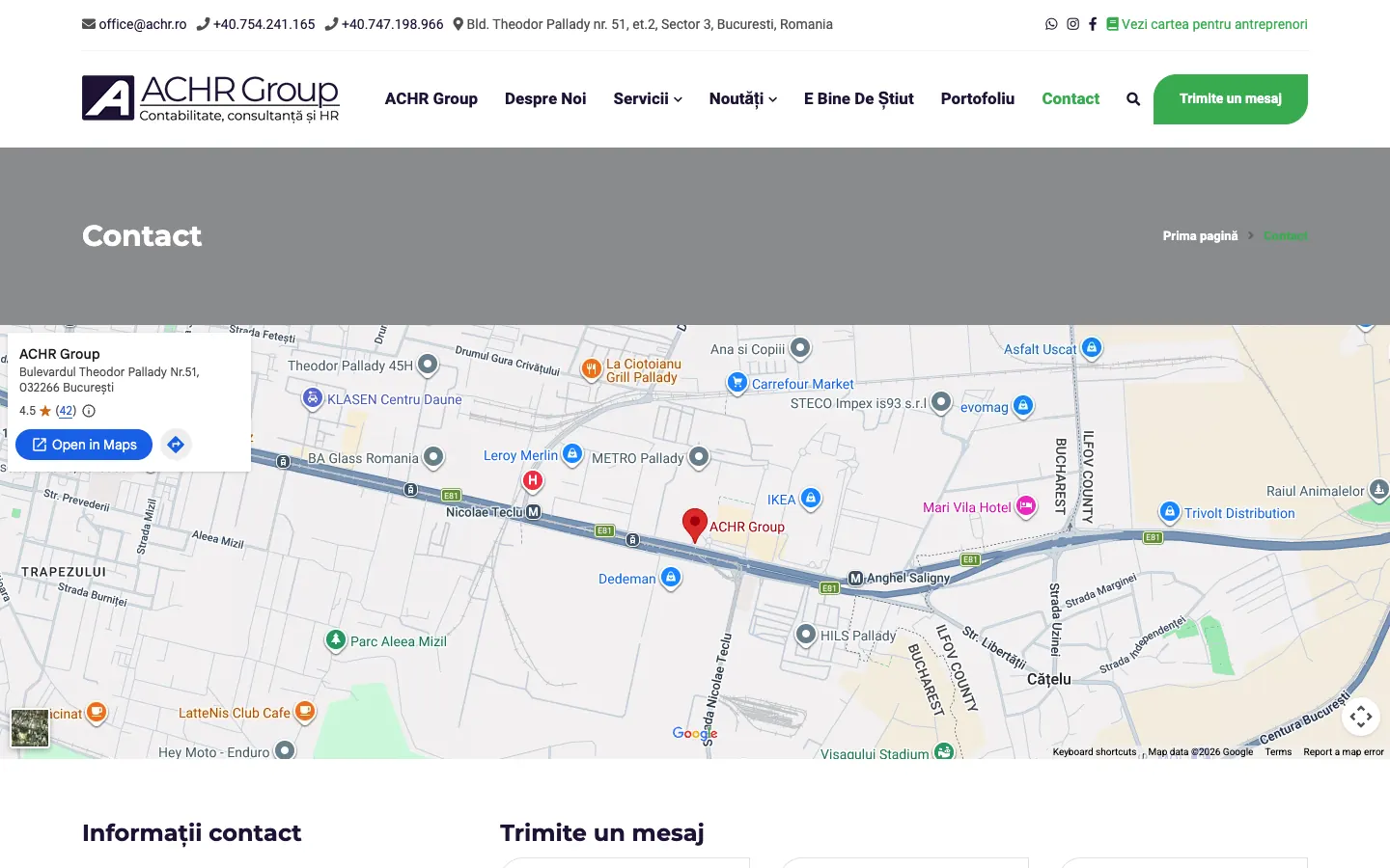
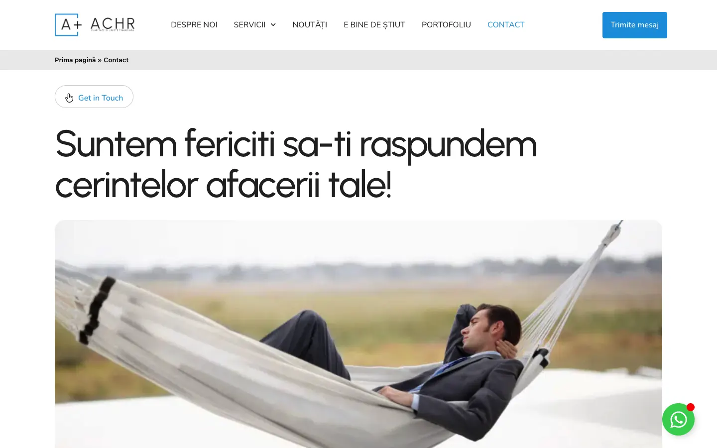
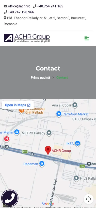
The form comes before the map, and the page promises an answer within 24 hours. The message is warm and addresses the reader directly: „Suntem fericiți să-ți răspundem cerințelor afacerii tale!” (“We are happy to answer the needs of your business!”). Before, the map filled the first screen and the form was a standard one, with no context.
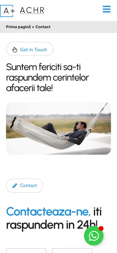
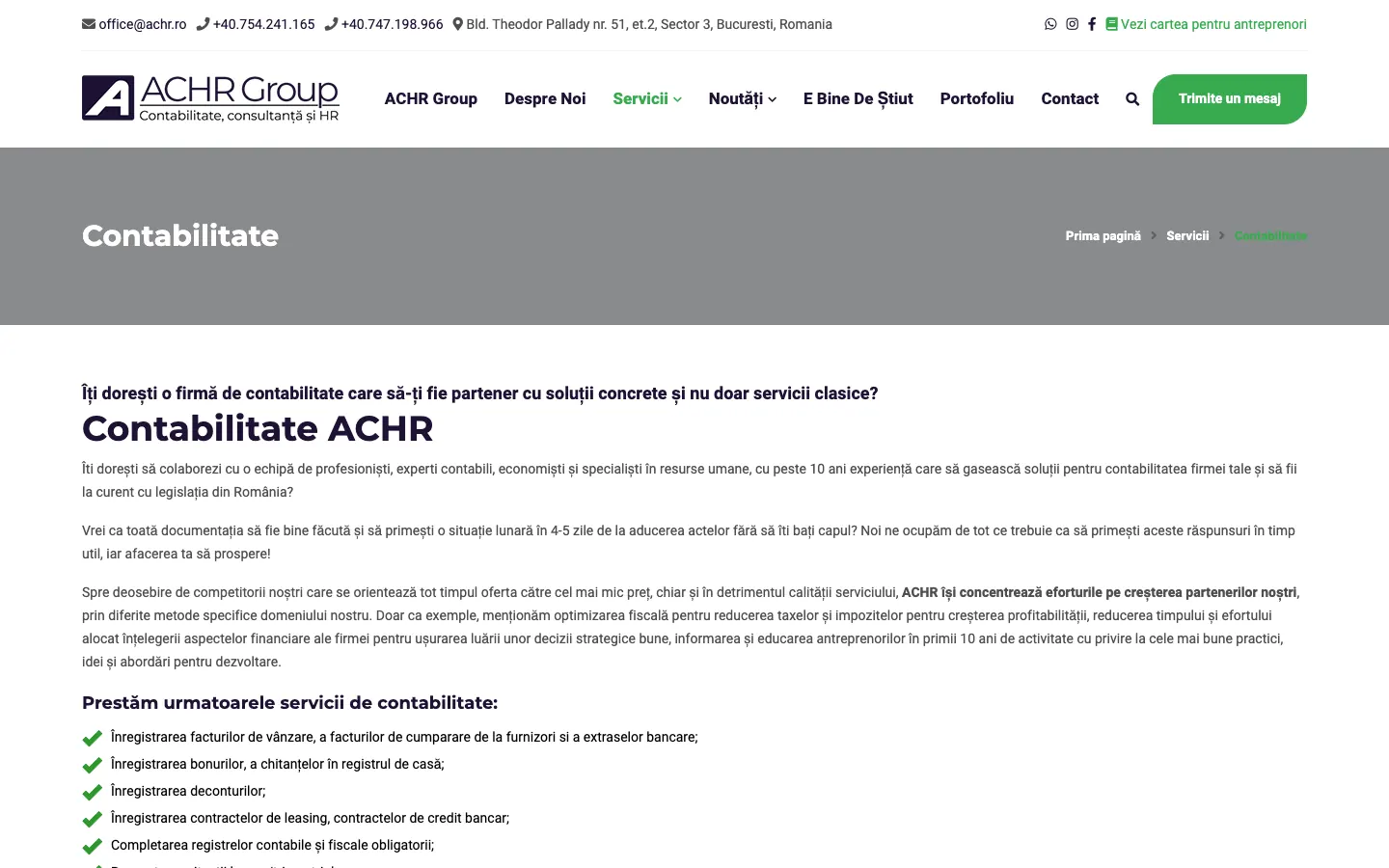
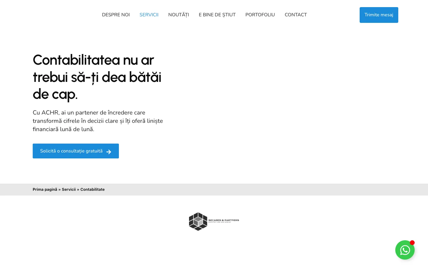
The headline starts from the client's problem, and the long checklists gave way to sections on benefits, on what the client gets, on their problems and on frequently asked questions.
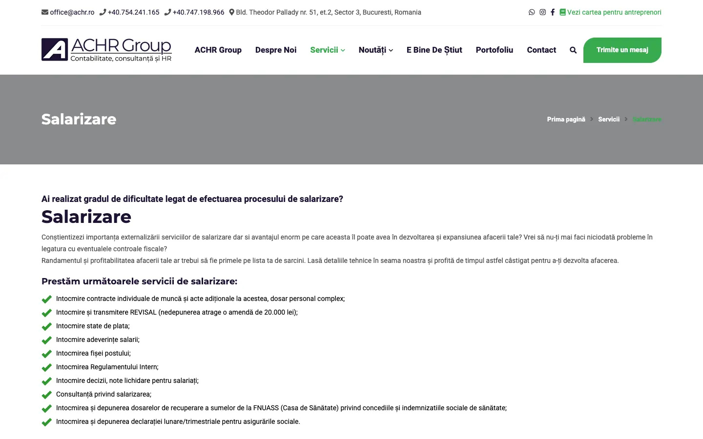
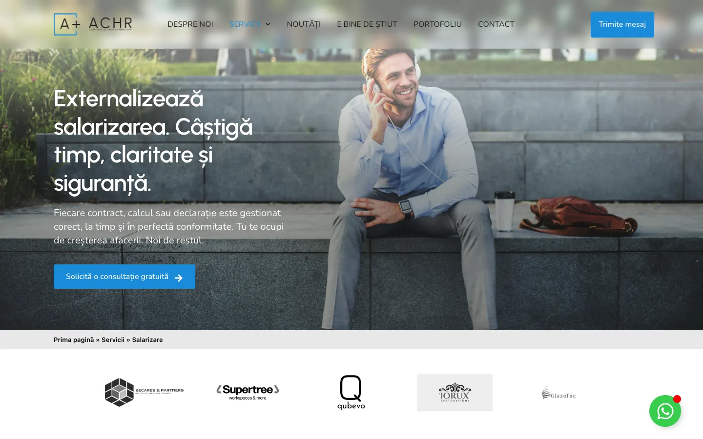
The headline promises time, clarity and security, and the page adds testimonials and answers to frequently asked questions.
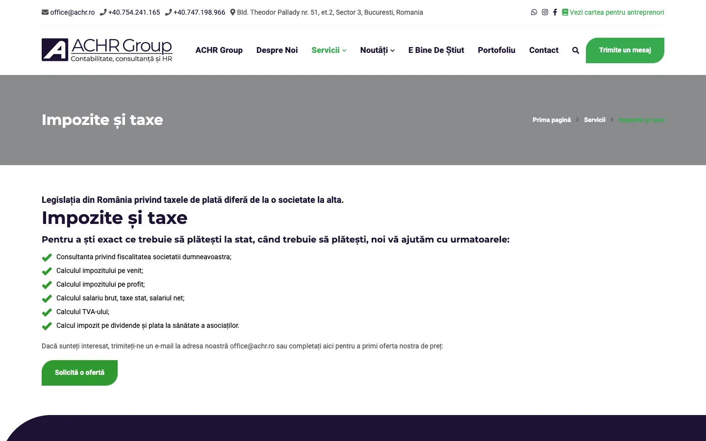
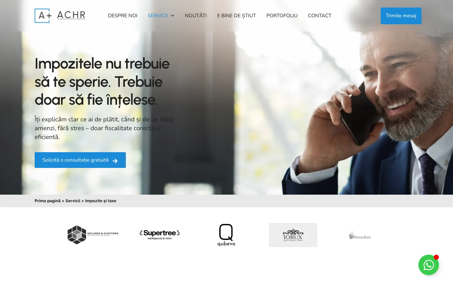
The headline speaks about the fear of taxes, and the page has a free consultation button, testimonials and FAQs.
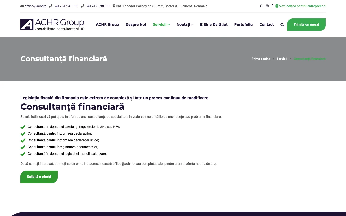
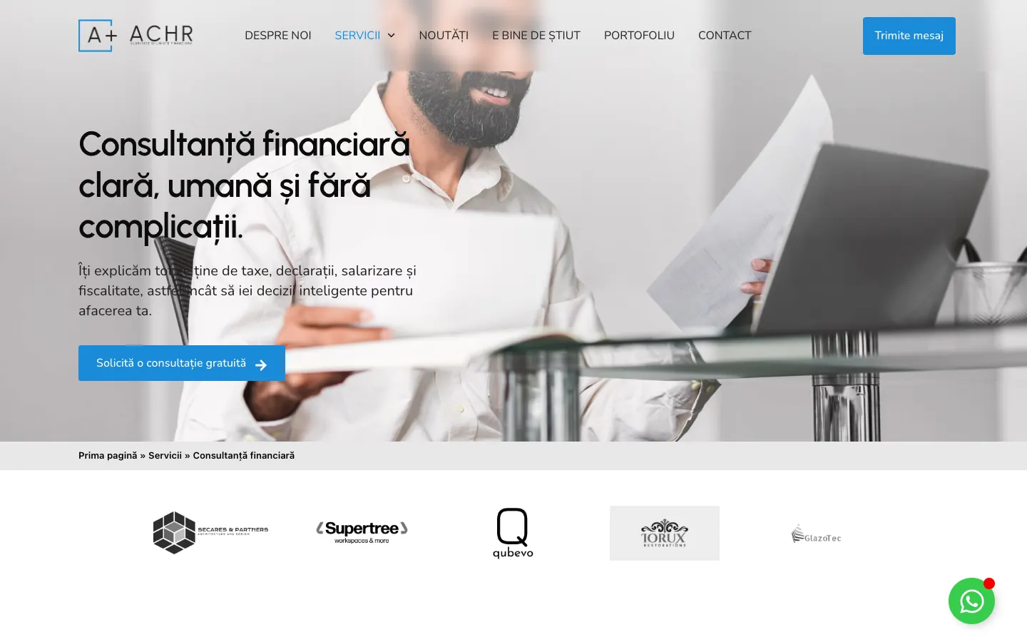
The headline says what the client receives: clear and human consultancy.
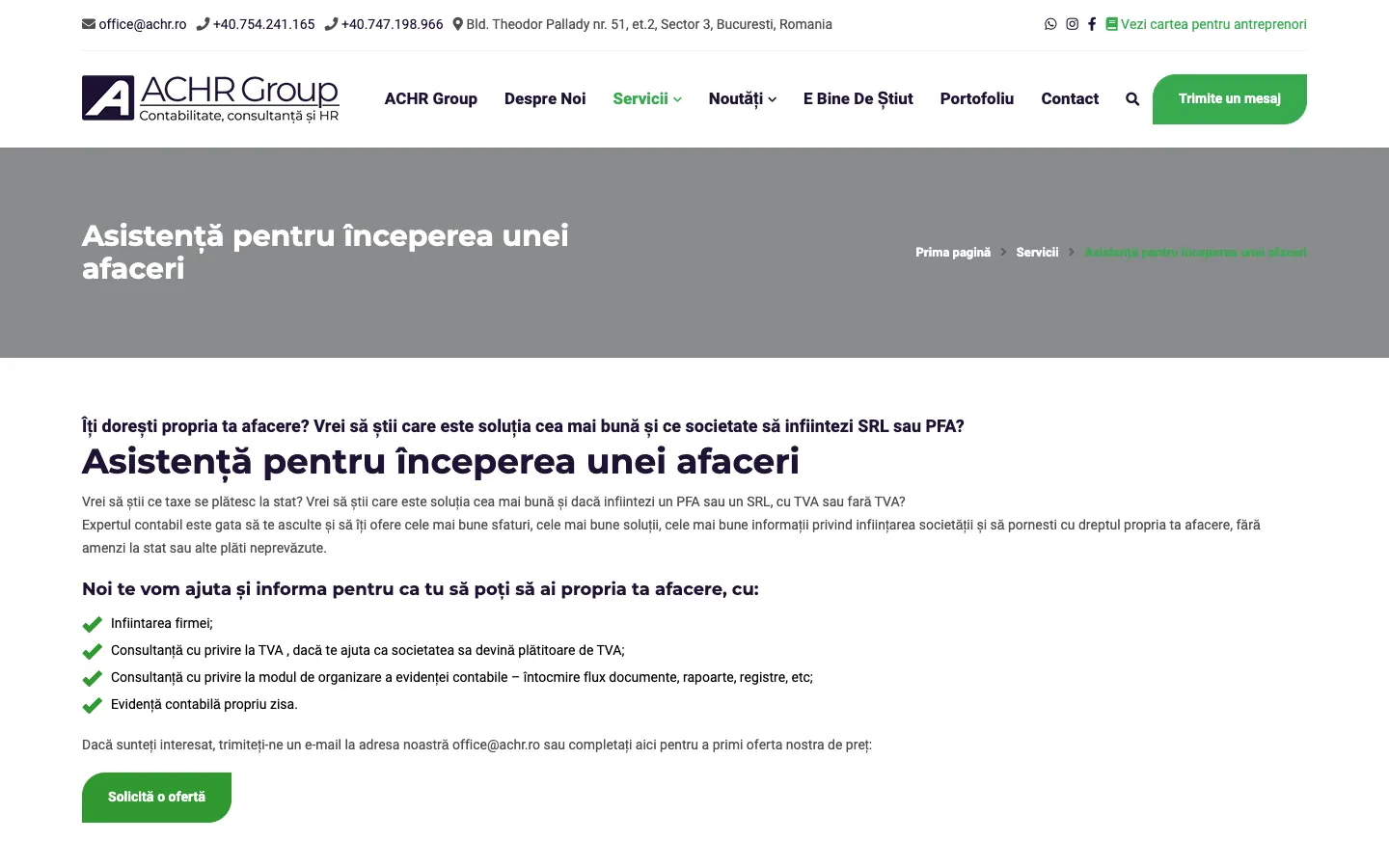
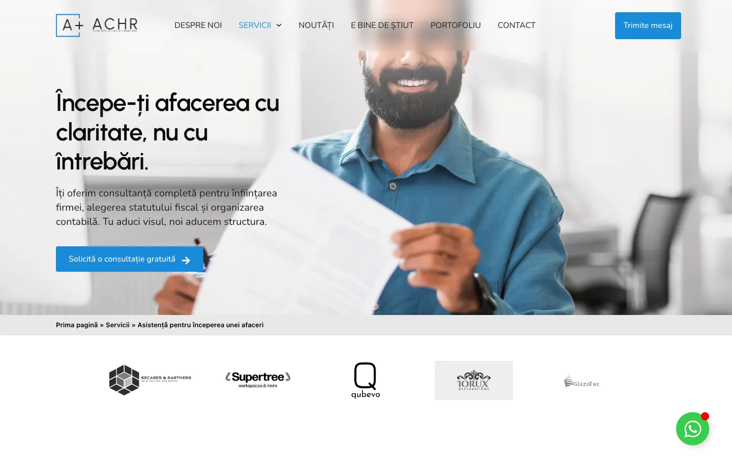
The old headline described the service, while the new one speaks to the entrepreneur who is just starting out. The page also has testimonials and a consultation button.
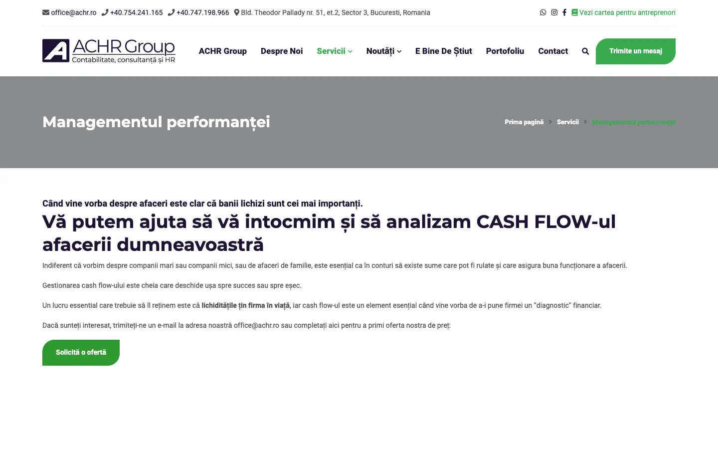
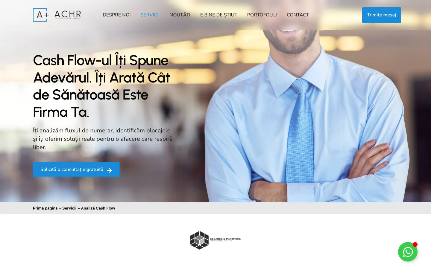
The long, formal headline became a short promise, and the page now has a free consultation button and testimonials.
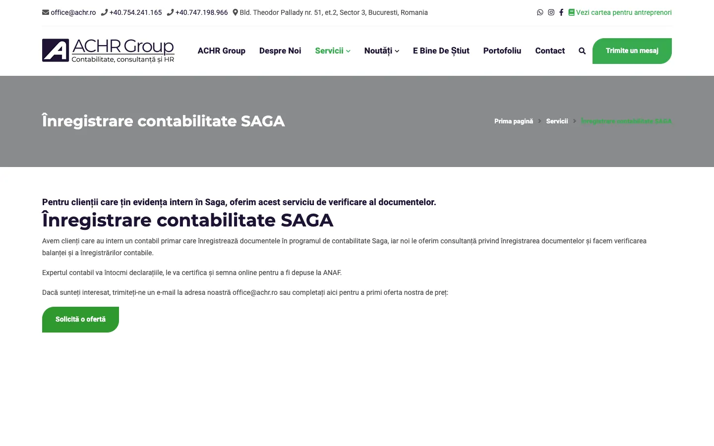
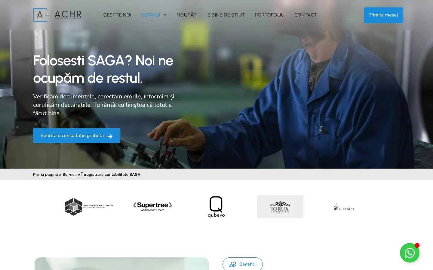
The headline speaks directly to people who already use the SAGA software.
Screenshots from 16 October 2026, the first screen of each page, from the old site and from achr.ro. The page headlines shown in the images are in Romanian, with English renderings in the text above.
We compared the first screen of the old website with that of the new one. Both showed the same message. On the old site, attention went to the header and the decor. On the new one, the headline receives three times more attention, and the header almost disappears from the attention map.
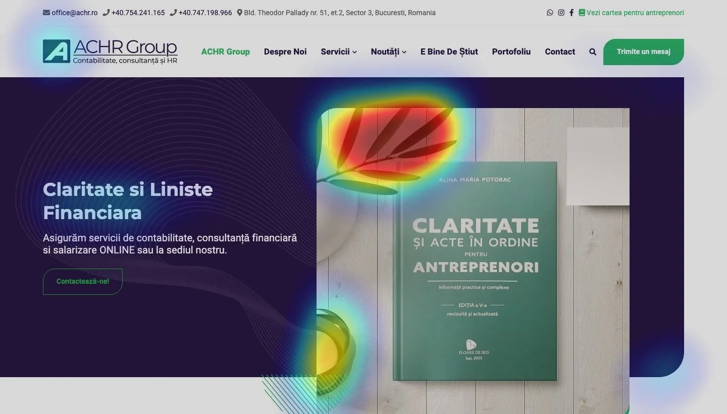
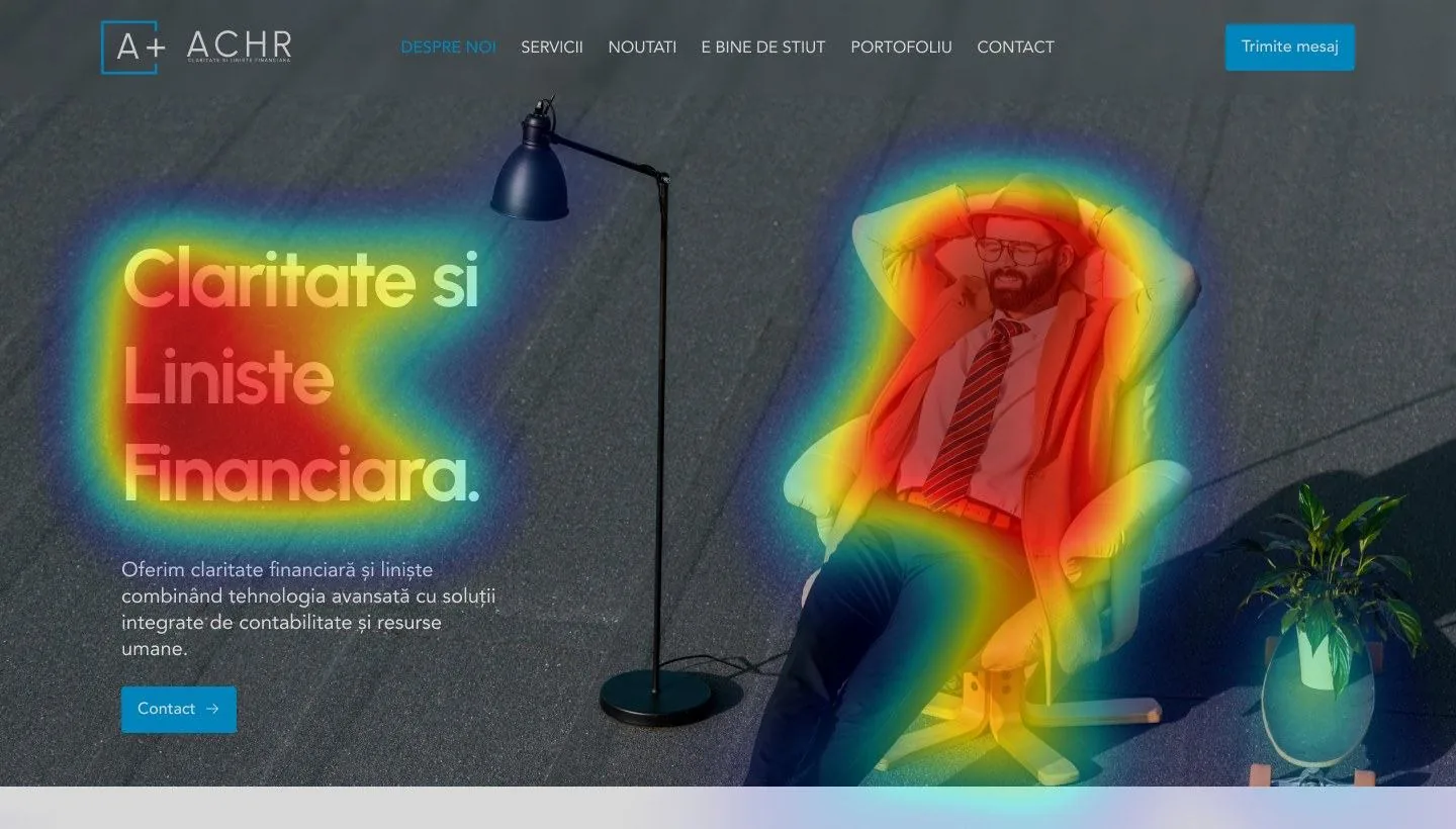
We applied the same residual spectral saliency method (Hou & Zhang) to the 1440×820 px first screen of both versions, which showed the same message. It is an algorithmic analysis of visual contrast, without eye-tracking, so it describes what draws attention in the design.
The brief for the service pages, written in March 2025, set the free consultation as the single main action on all pages.
Client logos sit right below the main image, and testimonials follow them, on the homepage and on every service page.
Each service page has a FAQ section that answers the client's objections, and short calls to action along the page.
The form asks only for contact details, the company's tax ID (CUI) and the message, and the page promises a reply within 24 hours.
Screenshots and counts from 16 October 2026, from the old site and from achr.ro, checked in the structure of the pages.
Revenue Acceleration Architect, UNRIVALS. He led the project, from strategy and data analysis to repositioning, content, site structure and communication. View profile
He created the design of the identity, the brand book and the website. View profile
Websenior: WordPress implementation of the new website.
ACHR is an accounting company, yet this happens whenever a company works well and is seen less than it deserves. Mihai Stanca put it this way, saying that the site looked outdated and the company looked behind on the legislation.
The differentiator often already exists inside the company. We find it, turn it into a message and build the system through which the message reaches the client, from brand and website to every piece of communication.
A short diagnostic: we show you what your market says, what you say, and where the difference between the two gets lost.
Request a diagnostic