ROTOFEI was designed for Traditional Trade stores and for rural shoppers on medium to low incomes. The name, the mascot and the packaging all started from the way this shopper understands good food, and the range later made its way into modern retail as well.
AGIL Timișoara needed a range of cured meats that would stand out on the shelf, in a category where many producers built their identity solely around the company name. The project covered market analysis, naming, verbal identity, the mascot and the packaging design.
The direction became clear during the analysis, through a personal memory of the project's author, Daniel Roșca. That memory produced the name ROTOFEI, and the name then organised everything else, from the character and the slogan to the label colours and the price shown per piece.
The market analysis looked at what Traditional Trade shoppers value, how they choose cured meats and which associations make them feel familiarity and trust. The category analysis recorded in the brand manual showed that many producers built their identity around the company name, with no graphic elements to set their product ranges apart.
For AGIL, the opportunity was a range brand with its own name, its own character and a distinct presence on the shelf. Choosing the direction, however, meant understanding the values of the target audience. A branding specialist's reference points can be very different from those of a shopper in a village store, where the familiar meaning of a word, an association formed within the family or the way people talk about good food can decide which product ends up in the basket.
The name emerged during the market analysis, from one of Daniel Roșca's memories. His grandmother used to pinch his cheek and tell him how healthy he was. For her, full cheeks, a chubby look and vigour meant that a child was doing well, that he was fed and cared for.
The memory showed, in the middle of the analysis, how different this shopper's values could be from a branding specialist's reference points. In this reading, “healthy” meant sturdiness, enough food and vitality, a meaning shaped within the family and in everyday life, which the brand could express. Out of this understanding came ROTOFEI, a Romanian word that brought together the roundness, cheerfulness and familiarity the range was looking for.
“Rotofei” was chosen for its meanings of “chubby”, “plump” and “round”, and also for the warm, expressive tone of the word. The name supported the direction of the project, a brand that is cheerful, round, lively, rustic and traditional.
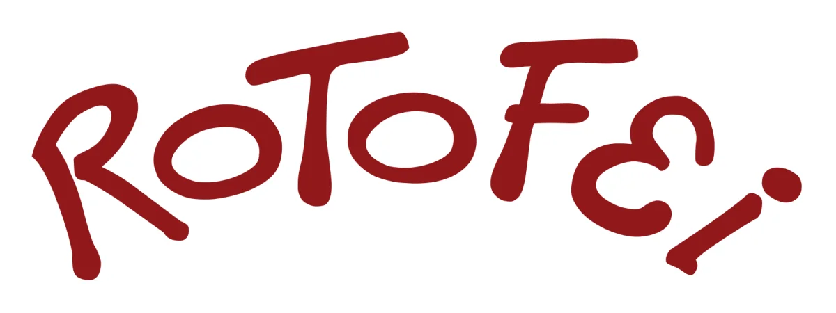
The word also had a useful linguistic quirk. In Romanian, the form “rotofei” agrees equally well with the masculine noun “salam” (salami) and with the neuter plural “mezeluri” (cured meats). Once the character was introduced, the attribute became a proper name, and ROTOFEI could stand both for the product range and for the piglet that represented it.
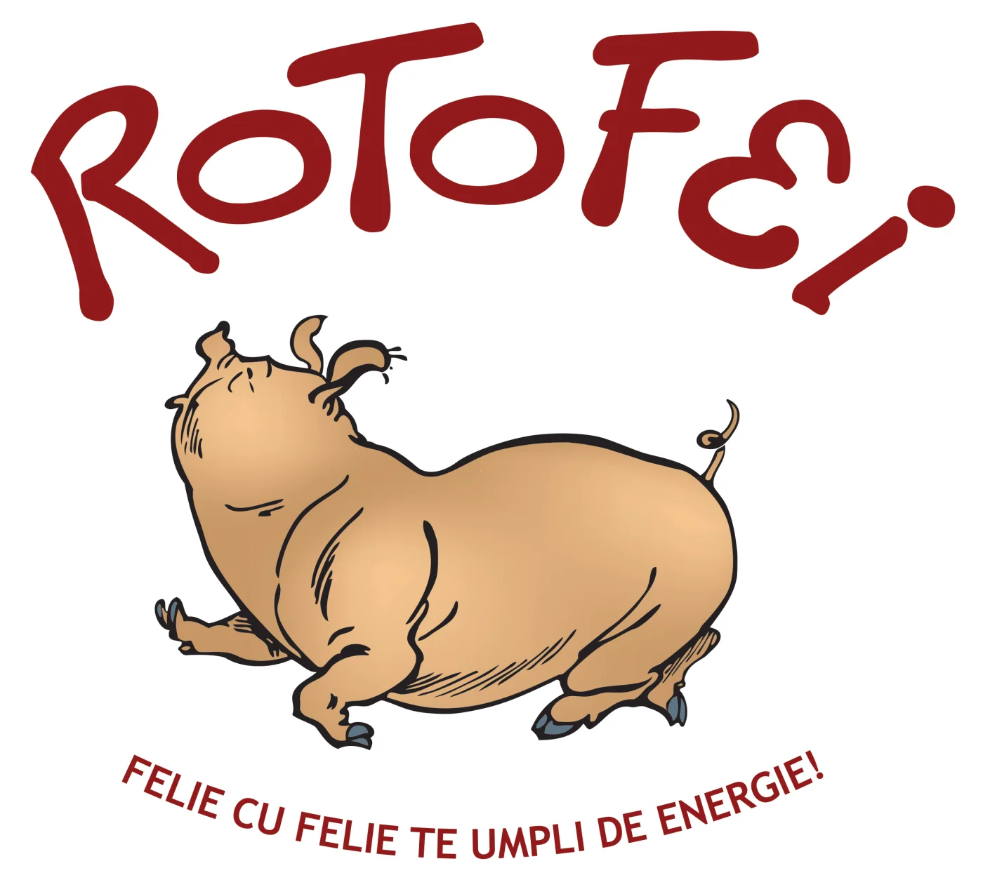
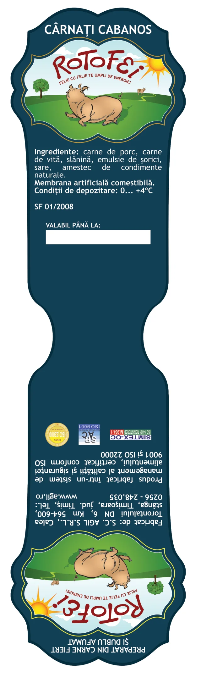
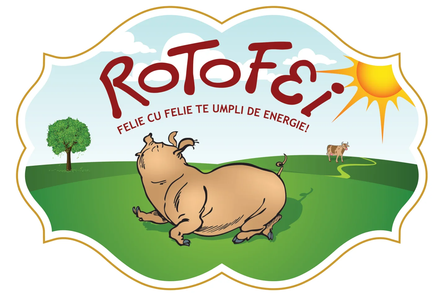
The chosen character was a cheerful piglet, drawn in a pose that suggests singing and dancing. The choice was directly linked to the main raw material of the products and turned the meaning of the name into an image.

The piglet gave the range an easily recognisable element that can also be used separately from the logo. The brand manual called for its use on promotional materials, to keep continuity between packaging and communication. The mascot thus turned the name into a character that can accompany the brand in many contexts.

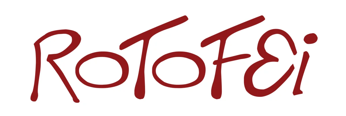
The logotype was based on the “This is electronik” typeface, modified to support the character of the brand. The letters were thickened, the “E” was adjusted for legibility, the slant of the horizontal strokes in “T” and “F” was reduced, and the two “O”s were given a subtle difference. The concave curve of the name completes the composition and frames the character, while the shape of the letters reinforces the round, lively expression of the identity.
The slogan, “Felie cu felie, te umpli de energie!” (“Slice by slice, you fill up with energy!”), carries the association with food and vitality further. Its rhythm ties the tone of the brand to the act of eating slice by slice and makes it easy to remember. For supporting text, the manual recommended Trebuchet MS in Regular, Bold, Italic and Bold Italic, for legibility and consistency across materials.
The identity was placed inside a medallion with a natural setting of pasture, path, tree, a small cow, sky, clouds and sun. The composition continues the rustic direction of the brand and gives the whole range a common frame.
Blue was chosen as the label background to set it apart from competing packaging described in the manual, which mostly used red. The name and the slogan kept the red, the character uses tones close to skin colour, with blue-grey for hooves and shadows, and the medallion is highlighted by a gold outline printed as a separate colour. Every component has a role. The name identifies the range, the character gives it expression, and the background and outline help the pack get noticed on the shelf.
One commercial component of the project was showing the price per piece through a flag built into the packaging. The price per kilogram makes products comparable, but it takes an extra calculation to work out what the piece in the shopper's hand actually costs. The price per piece puts the amount the shopper really pays front and centre.
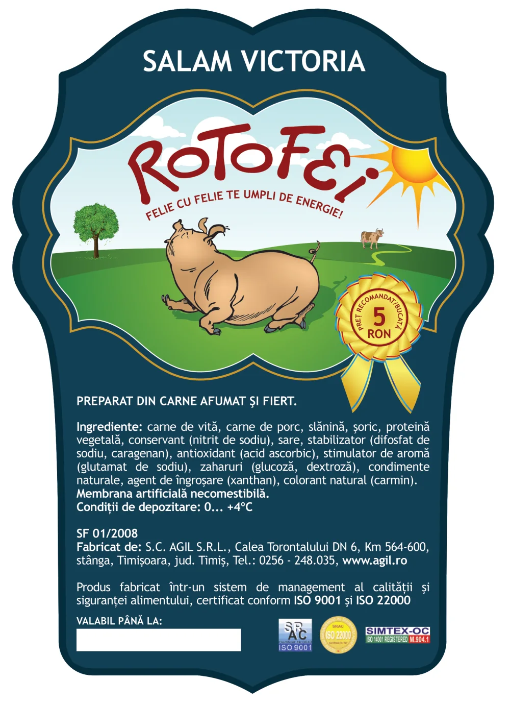
For this audience, the approach makes it easier to judge the purchase and fit it into a budget. The packaging thus offers commercial information that is easy to use at the moment of choice, alongside the elements that make the brand easy to recognise.
“It dried up the competition's cured meats on the shelf.”Gabriel Bordea, Sales Director, AGIL Timișoara
That is how Gabriel Bordea, Sales Director at AGIL Timișoara, described the range's performance. The quote reflects how the producer judged the commercial result of the range.
The results in Traditional Trade later led to the range being listed in Key Accounts and International Key Accounts (KA and IKA), where, according to the producer, ROTOFEI continues to sell successfully. The expansion matters because the buyer profile in these channels was never the original target, and an identity built on the values of a precise audience proved attractive in a different buying context too.
ROTOFEI illustrates three principles that the UNRIVALS methodology applies today with the companies it works with.
When the attribute is encoded in the brand name itself, the advertising works on its own. With ROTOFEI, the idea of a healthy, well-fed child became the name of the range, and the slogan and the character carried it further.
AGIL remained the producer, while the range received its own name, its own character and its own presence on the shelf. In a category where competitors signed their products with the company name, the range brand became the differentiator.
A brand wins when it holds a place in the buyer's memory, so that the choice comes naturally the moment the need appears. A name that expresses a value familiar to the buyer gets there faster than the name of a company the buyer does not know.

This is a qualitative reading based on the eight dimensions of the Signal Coherence Score™. We did not calculate a score for ROTOFEI.
The project produced a complete identity system, with the ROTOFEI name, the slogan, the custom logotype, the mascot, the colour palette, the typography guidelines and the packaging structure. The system was applied to several products in the range, with the same visual and commercial structure.
Its strategic value lies in the link between understanding the consumer and making brand decisions. The memory of a familiar gesture clarified a system of values, that system guided the choice of name, and the name organised the character, the slogan and the packaging. The commercial result reported by the producer and the wider distribution complete the picture. ROTOFEI started from an analysis of the Traditional Trade buyer and went on to work in modern retail too, with an identity that kept its coherence.
In a short diagnostic we show you what your brand says in the market today and where the right starting point is.
Request a diagnostic