
The rhombus in the UNRIVALS identity is not a design choice, it is a positioning decision taken on an economic criterion. This article explains what that criterion is, why the shape has travelled thirteen thousand years without losing its meaning, and what separates a symbol that works for a company from one that merely costs it money.
TL;DR. A symbol is worth nothing on its own. It is worth exactly the number of identical repetitions a company can sustain without getting bored, multiplied by how precisely its meaning overlaps with the attribute the company actually sells.
The rhombus works for us because it carries the same meaning at sixty four pixels in a navigation bar and at three metres on a billboard. Any symbol that fails that test stays an ornament paid for out of the marketing budget.
Why do good companies end up competing on price?
Because the market does not buy what is best, it buys what it understands fastest. When every competitor promises quality, reliability and on time delivery, the buyer is left without a single marker that separates one from another. So the buyer falls back on the one criterion that reads instantly, which is price.
Seen this way, the price war is not the cause of the problem, it is the effect of positioning that was never sharp enough. Plenty of companies have built good products, hired capable people and stood up solid operational infrastructure. They still ended up trapped in a space where the market treats them as interchangeable with dozens of alternatives.
The consequence shows up in three places at once, because margins compress, the sales cycle stretches, and growth starts depending on raw commercial effort rather than perceived value. The company works harder for every unit of revenue, even though nothing inside it got worse.
In a market where suppliers are compared mostly on specifications and price, marketing has exactly one real job, and that is to create the second dimension of comparison. Not what the company does, but what it represents. Every conversation about symbols starts here, because a coherent symbol is the least costly carrier that second dimension can have.
What does a symbol actually do for a company nobody knows yet?
It buys recognition before the name gets read. A brand settles into the subconscious through repetition, even unread, which is how the swoosh on a pair of Nike shoes does its work, and what accumulates over time is perception rather than information. The condition is that the visual must agree with the attribute the company claims.
This is where most visual identity budgets disappear. A company commissions a handsome logo, replaces it eighteen months later because someone got tired of it, then renders it differently on every channel. Each of those gestures resets the repetition counter. Three years later the company has paid three times for zero accumulated memory.
A symbol that costs almost nothing to reproduce and stays hard to confuse does the opposite, because it can sit on a banner, a report cover, a slide, a package and a navigation bar without losing its shape. Recognition then accumulates on one object instead of scattering across five variants that resemble each other without ever being identical.
The quality test for a symbol is not run on the designer’s large screen, it is run at the smallest size the company will ever use. The smaller it stays legible, the better it is, because small is precisely the context in which it appears most often.
Why did UNRIVALS choose the rhombus and not another shape?
Because the rhombus is the only simple shape that already contains the transition we sell. Early on, any company is judged by what it does, meaning products, specifications, capacity and price. As its position sharpens, the centre of gravity shifts from execution toward perception, and the company starts being chosen for what it represents.
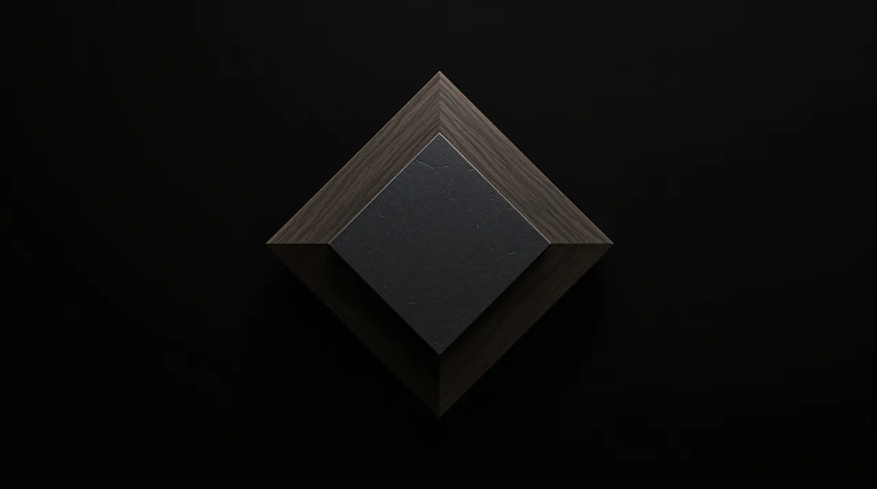
Geometrically, the rhombus carries exactly that tension. It has neither the immobility of the square nor the directional indifference of the circle. It has an axis, so it has a direction of travel, and it has an apex, so it has a point where energy concentrates. A shape with an axis communicates direction before the first word is read.
A single attribute, carried by the same visual grammar, propagates identically through the name, the tagline, the imagery, the sub brands and the copy. That produces system coherence, and system coherence is what turns communication spending into capital. Red, verticality, rhombus and column are not five separate aesthetic decisions, they are one decision repeated in five places.
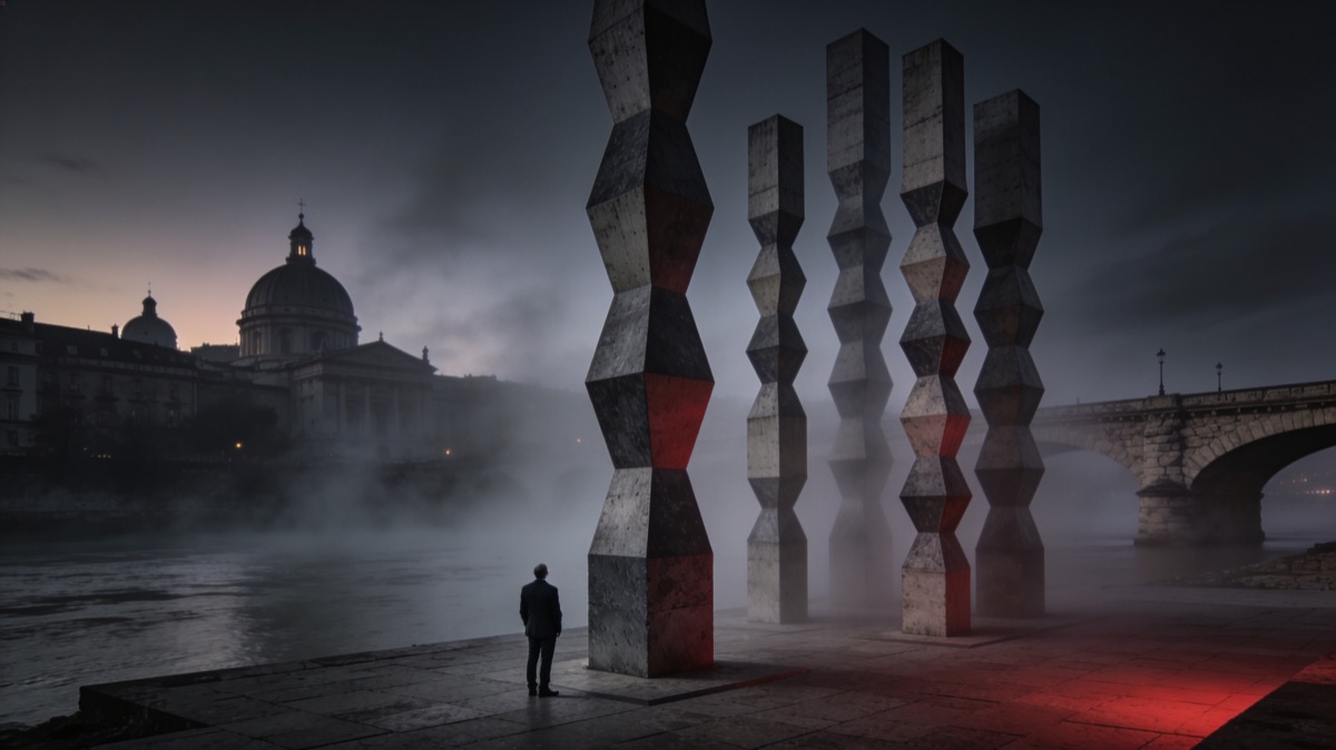
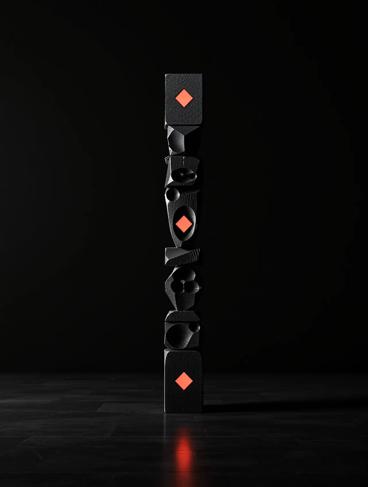
The decision was also taken in the field, not only on paper. On our own site the hero image was swapped from a generic arcade to Brâncuși’s Endless Column, because the brand rhombus mirrors the column module literally. The same move forced a compact lockup in the navigation bar, with the tagline turned white and bold, because the previous version became illegible at exactly the size where it is seen most often.
What connects a prehistoric cave site to a twentieth century sculpture?
Roughly thirteen thousand years of continuity in the same geometric motif. At Cuina Turcului, a rock shelter in the Danube gorge on the territory of present day Romania, archaeologists found one of the oldest known symbols of the Carpatho Danubian space, dated to around 11,000 BCE. The motif then reappeared, millennium after millennium, in textiles, ceramics, sculpture and vernacular architecture.
The Romanian writer Ionuț Țene carried the same line to its end in an essay published by Curierul Național in March 2025. For him the main meaning of a column built from rhombuses is to be “the axis of the world”, one that “links the centre of the earth to the vault of the sky, man to heaven” (our translation).
The reading is worth weighing, because it comes from cultural history rather than from a design studio looking for a justification for a shape already chosen.
Ethnographers confirm the same lineage by another route. The rhombus in traditional Romanian weaving directly inspired Brâncuși in his choice of form for the column modules, according to an analysis published in 2022. The shape was not invented by the sculptor, it was taken from a repertoire his viewers already recognised without being able to name it.
Inside that story sits a branding lesson less romantic than it sounds. The symbols that survive are not the most complex ones, they are the ones that compress a lot of meaning into a form anyone can redraw from memory. A symbol your customer cannot sketch after seeing it ten times will not stay in memory after a hundred.
Petroșani, the city of the Column and the lesson of captured value
The modules of the Endless Column were cast in iron in September 1937, at the Central Workshops in Petroșani, and the monument was inaugurated at Târgu Jiu in 1938. Engineers and workers from a mining valley turned an artistic idea into an object that later entered the universal heritage.
Very few people outside that region know it, and some inside it found out late. The execution was local, the symbolic value accumulated elsewhere. Nobody stole anything, there simply was nobody to claim the connection at the right moment, in the right terms.
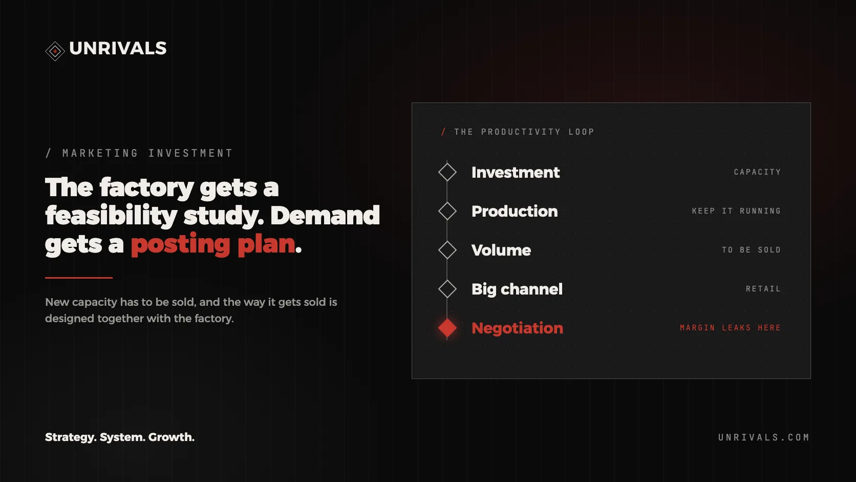
That mechanism repeats across the economy with tiring regularity. One company builds the infrastructure, ships the product and does the hard work, while somebody else captures the larger share of the value through positioning, category and brand. The distance between executing and owning is not measured in competence, it is measured by who occupied the mental space of the category first.
That is, in its shortest form, the difference between doing and representing. The company that executes enters every conversation as a supplier and renegotiates price from scratch each time, while the company that has come to represent the category sets the benchmark everyone else negotiates against.
How does the gap between execution and ownership show up in numbers?
It shows up in public figures rather than opinions, and the pattern is global before it is national. The intangible value of companies worldwide was approaching one hundred trillion US dollars in 2025, according to analysis published by the World Intellectual Property Organization. The part of a company’s worth that sits in brands, categories and intellectual property overtook the part sitting in machinery a long time ago.
More relevant for a board is how much of that value stays invisible in the accounts. Brand Finance reports that roughly 79% of global intangible value never appears on balance sheets, in a study reissued annually since 2024. What does not get measured does not get managed, and what does not get managed erodes quietly.
Romania makes a clean worked example of the same pattern, because the execution side is documented and strong. The Romanian technology and communications industry reached a turnover of 23.6 billion euro and a 6.67% share of gross domestic product in 2024, and in the first seven months of 2025 it became the country’s leading services exporter, which shows that a shortage of technical competence was never the problem.
At the other end of the chain sits the problem. ANIS, the same industry association, estimates that Romania could add up to 40 billion euro to its gross domestic product if the industry moves from services executed for others toward its own products and intellectual property, a projection published in 2025. That distance is the captured value deficit, expressed in money.
In the training programmes we ran with ARIES, the industry association for electronics and software, the conclusion repeated with every cohort. The companies had the engineers, the processes and the international clients. What they lacked was a category of their own, which means they lacked cognitive ownership, so there was no need whose appearance made the market think of them automatically.
What separates an ornament from a symbol that works?
Five control questions, answered with evidence rather than taste. We use them as a filter before recommending that a company invest in a new identity, because quite often the right answer is to invest nothing and instead repeat what already exists with more discipline.
| Control question | Ornament | Symbol that works |
|---|---|---|
| What it means | nothing outside the brand deck | the central attribute of the company |
| Where it appears | on the logo and the business cards | at every touchpoint, identically |
| What happens if you remove it | nobody notices | the communication loses its recognition |
| How it gets measured | in the creative review | in cost per click and branded search volume |
| Who can copy it | anyone, in two hours | nobody, without looking like an imitator |
The last row is the one that decides. If a competitor can adopt your symbol without the market accusing them of imitation, the symbol carries no territory, it stays decoration, and decoration does not produce margin.
On which layer of a company is the coherence of a symbol decided?
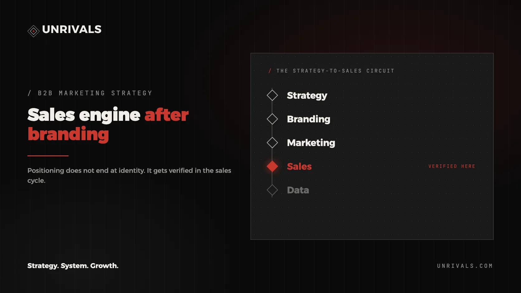
On the last of the four layers we work with, and their order is not a methodological preference, it is a constraint of causality. Each upper layer determines how expensive the layer beneath becomes, which is why a company that only repairs the bottom keeps paying for the same repair forever.
Layer 1 is performance marketing, meaning paid and organic traffic, measured in cost per click, cost per lead and return on spend. The symptom is visible here, never the cause. A company that shuffles budget between channels stays on Layer 1 and maintains the same ceiling.
Layer 2 is the commercial layer, meaning pipeline, win rate, cycle length and the way marketing hands over to sales. Most companies operate exclusively on Layers 1 and 2, which is where the feeling comes from that marketing stopped working the way it did three years ago.
Layer 3 is the AI Brain, the orchestration layer where company memory, customer profiles and methodology become machine readable. It does not choose the symbol, it makes the choice taken above apply identically on every channel, without depending on what one person remembers on a busy day.
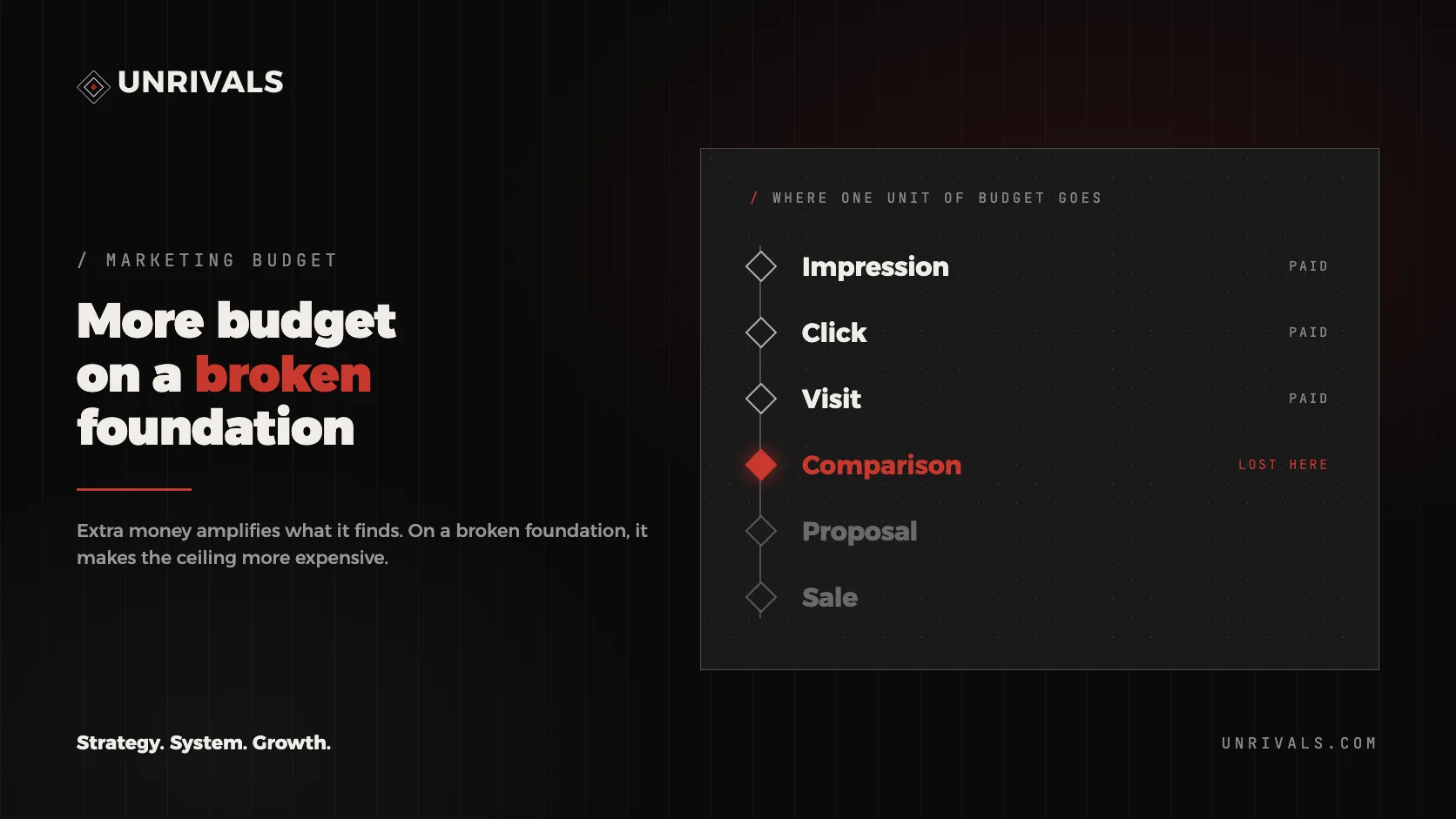
Layer 4 is positioning and category design. This is where what the symbol has to mean gets decided, and everything underneath merely executes that decision. An unclear brand levies a cognitive tax on every impression, and reducing that tax lowers cost per click while raising return on spend.
The bridge between branding and performance runs through Layer 4, not through endlessly optimising the same campaign. A marketing budget should serve development, meaning strategy and architecture, rather than maintenance of the click auction. The order of work stays the same at every company, with an infrastructure diagnosis first, then the attribute, then brand positioning, then marketing architecture, and only at the end the identity and the commercial system.
What does the rule look like inside real companies?
Most often, the proof already existed inside the company and was simply not communicated. Across the positioning audits we have prepared, that pattern appeared often enough to change the order in which we work. We now look for the uncommunicated asset before building a new attribute.
At Dr Daniela Ionescu’s ENT clinics, the correct territory was already written by the company, only it was written in the wrong place. Eight trademarks registered with OSIM, the Romanian trademark office, existed on paper, with no corresponding memory in the market. The move we proposed was not to invent a new sentence, it was to bring forward the sentence already buried on a secondary page.
At Ivatherm, a dermocosmetics producer, the situation was inverted, because the category position was the strongest asset and its exposure was the weakest. The proposal was that the company stop producing product names and start creating a vocabulary of its own, because product names invite comparison while a vocabulary gets borrowed.
At the Romania China Chamber of Commerce we worked through a symbol rather than a message. The cultural bridge was built in both directions, through the Cucuteni motif for Romanian companies and the Yangshao motif for Chinese ones, starting from a simple observation about how continuity produces trust. A myth several millennia old that both audiences recognise as theirs does work no new tagline would have done.
At MovingBox, a relocation company we worked with, the hypothesis we started from explains why a coherent symbol is not an image expense. A property developer handing over a new residential complex concentrates in one partner the volume a relocation company otherwise gathers client by client, over many months. Whoever is recognised as the representative of the category gets into that conversation, and whoever is not recognised pays for each client separately.
What does all of this mean for a company looking at its own logo right now?
That the right question is not whether the leadership likes the logo, it is whether the company can repeat it for ten years without changing it. A symbol replaced every two years never gets the chance to become memory, however good it looks on the day it is presented in the meeting.
The second question is whether the symbol carries the attribute or only the name. The difference tests quickly. Cover the company name, show only the shape to somebody from your market, and they should be able to say which category it belongs to even if they miss the exact company. When they cannot, the shape carries nothing.
The third is whether the symbol survives at the smallest scale. A logo lives in a sixty four pixel navigation bar, in a round social avatar and in the corner of a slide, not on a billboard, so a symbol that needs space in order to work will rarely work.
The rhombus is not beautiful by accident. It is the bet that a shape which has lasted thirteen thousand years has better odds of lasting the next ten years of a brand plan than a shape invented last month to look contemporary. Market perception builds slowly and collapses quickly, and continuity is the only strategy that works in your favour while you sleep.
Frequently asked questions
Is the rhombus an exclusively Romanian symbol?
No. The rhombus appears in almost every ancient culture, from European neolithic ceramics to Central Asian textiles. What is specific to the Carpatho Danubian space is the documented age of the motif and its unbroken continuity into twentieth century folk art, and from there into Brâncuși’s sculpture.
How often should a company change its visual identity?
Far less often than actually happens, and execution refinements such as proportions, legibility or channel variants can be made at any time. The central shape and the attribute it carries should stay stable for at least one full market cycle, because that stability is precisely what produces the recognition being paid for.
Can a good symbol compensate for weak positioning?
No, and the attempt costs twice. A symbol amplifies whatever already exists, so a strong symbol on confused positioning only accelerates the spread of the confusion. The correct order starts with the attribute, continues with positioning, and only then arrives at the form.
How do I tell whether my campaigns are paying a cognitive tax?
By comparing cost per click in brand campaigns against product campaigns, tracked over the same period and the same audience. When branded search volume stays small relative to competitors, and costs climb month over month without any change in the auction, the cause usually sits in the foundation rather than in the campaign settings.
What do we do if the current symbol already has recognition but carries the wrong attribute?
You do not throw it away. You keep the recognised shape and change what it means, through message, context and disciplined repetition. Rebuilding meaning on a shape people already know costs considerably less than building recognition from zero for a new one.
If you want to see this analysis applied to your own company, with public figures and a written verdict, ask for a positioning audit.